Sundae School has a useful answer to a tired cannabis-fashion problem: make clothes worth examining. The references reach beyond a leaf graphic, into Korean dress, immigrant identity and street photography. A uniform jacket can carry that conversation without putting a consumption joke across the chest. The clothes still need to work as clothes. Otherwise, the cultural reference is doing unpaid overtime.
The label describes its territory as smokewear, connecting cannabis culture with a Korean design vocabulary. Its recent Chinatown store makes that connection physical, while its campaign archive shows how it developed. Looking across those projects reveals something more specific than a brand selling several unrelated categories. Sundae School keeps returning to the question of how heritage looks when people actually wear it.
The idea existed before the store
In a 2018 CFDA interview, founder Dae Lim linked his interests in mathematics, fashion and cannabis. He described comfort and function as central to the label, alongside a challenge to narrow stereotypes. The interview placed Korean upbringing and American experience inside the design discussion. Cannabis was part of that identity, rather than the only thing available to print on a shirt.
That early explanation matters because it supplies a reference point for the later collections. A brand can claim almost any philosophy after its best-looking campaign arrives. Here, the questions were already on the table: how clothes move, what cultural references survive translation, and who gets represented. Those are useful things to look for when deciding whether a label has an actual point of view.
The same interview described the Spring/Summer 2019 collection through summer hanbok research and contemporary Korean art. Lim discussed translating traditional clothing into functional garments, including dimensional pockets inspired by Do Ho Suh's work. That is a concrete design trail, rather than a vague claim that everything is inspired by everything. The detail gives viewers somewhere to begin looking closely.
Heritage can show up in construction
Sundae School's current spring collection includes daenggi caps, a bojagi tie tote and pieces named for hanbok references. The names point toward a larger visual vocabulary of ties, wrapping and altered proportions. They also invite a closer inspection of how each garment is assembled. A reference becomes more interesting when it changes the object, rather than simply decorating its campaign.
That distinction is worth keeping in mind with cannabis streetwear generally. A print is visible immediately, while a closure or pocket can become apparent through use. Neither approach automatically makes better clothing. But they ask different things of the wearer, and they create different reasons to return. Sundae School's strongest proposition is that its cultural references can operate at both distances.
Its Fabric to Form editorial credits Audrey Bark for creative direction and Gayoung Lee and Yoonjun Lee for photography. Director Jaejoon Kim and stylist Minjin Park also appear in the credits. Those names reveal the team around the clothes. They give the audience a route into the wider creative work behind the label's public image.
The campaign archive gives the clothes a setting
The Rituals campaign is explicitly a Summer 2022 project. Its photographs place models beside water and across rocky outdoor settings, with Jinwoo Park credited for photography. Dae Lim and Audrey Bark receive creative-direction credits. The date matters: these are archival campaign images, not a claim about the label's current collection or available stock.
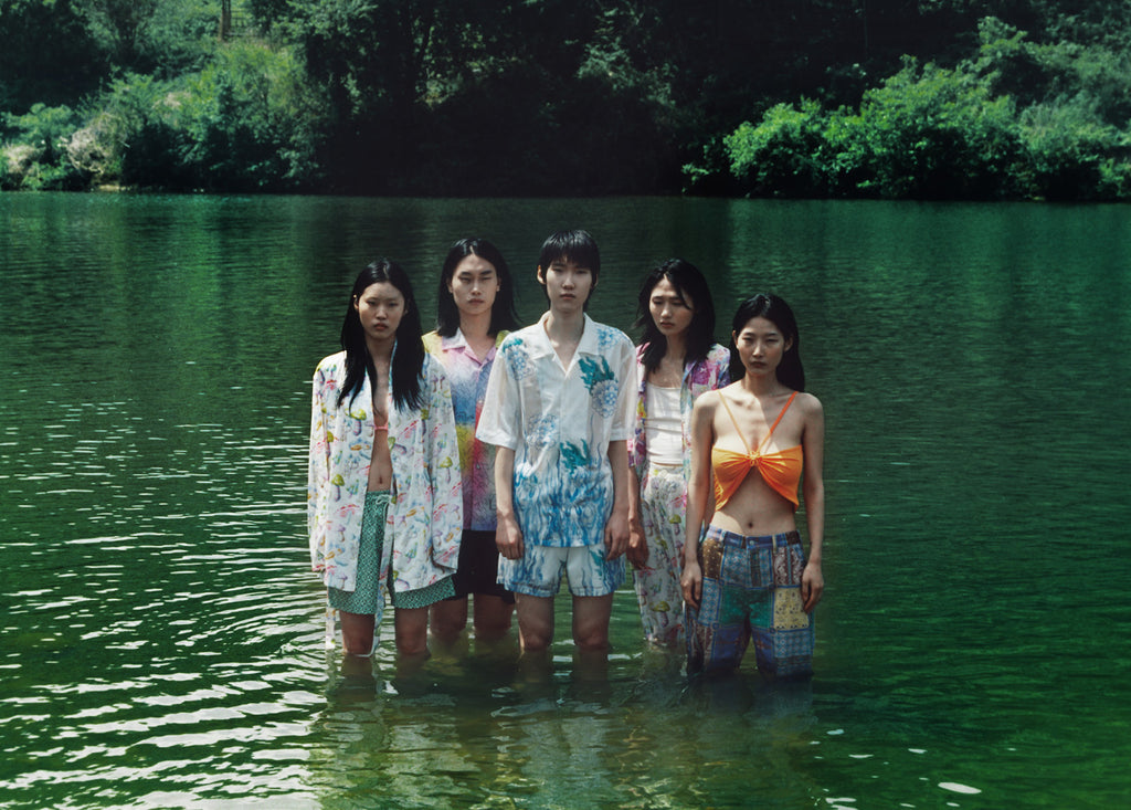
In the group photograph, water and foliage surround the clothes without becoming a generic scenic backdrop. The models occupy a shared space, and the garments read together rather than as isolated product listings. There is room to notice differences in silhouette and pattern. The result makes the collection legible as a small visual world, with its own cast and setting.
The later Heritage, but Make It China Town editorial changes that environment completely. School desks, chairs, brick walls and neighborhood activity frame uniform-inspired pieces. Photographer Nelson Huang and creative director Audrey Bark are credited on the page. The setting gives the school reference a literal prop, then places that prop somewhere less obedient than a classroom.
That shift is the interesting part. The label can carry related ideas from a lake to a city street without repeating the same photograph. In the Chinatown images, a desk becomes furniture for posing and occupying public space. The styling makes the academic reference slightly off-center. It feels closer to a group finding its own uniform than an institution issuing one.
A small store with a clear visual language
The label's physical address is now 117 Hester Street in New York. Hypebeast's May 2026 opening report documents the first permanent shop in Chinatown. Its photographs show pale curtains, metal display structures and repeated floral emblems. The room carries the brand's identity through surfaces and arrangement, giving the clothing a setting beyond an online product grid.
Wallpaper's July 2026 store feature identifies architects Nohar Agadi and Andy Kim, with lighting by Frank Favia. It describes the compact interior's Korean temple references and contributions from artist Hyunhee Kim. Those named collaborators make the space easier to understand as a designed project. The shop's appearance is attached to identifiable creative work.
The store photographs reward the same close looking as the clothes. Repeated forms link the backdrop to the display system, while the curtains soften the room's harder surfaces. A product can sit inside that arrangement without needing a separate explanation of the brand. That visual consistency is the compelling part. It gives visitors several ways to recognize the same idea.
Where cannabis culture enters the picture
The brand's own introduction connects Korean roots, California and a team drawn from immigrant, LGBTQ+ and POC communities. It also uses the name honor rollers for its community. That wording is part of the label's self-description, not evidence that every customer shares an identity. The more useful observation is how deliberately it makes room for a particular cultural perspective.
Cannabis fashion gets less interesting when every object has to announce the same obvious reference. There are other ways to make the connection visible: a useful detail, an unexpected material or a familiar object rebuilt. Our look at the SKYLRK joint phone case follows one such object. Sundae School offers a broader wardrobe through which to consider the same relationship.
The conversation extends beyond clothing. Houseplant's approach to home decor places cannabis-related objects inside a larger design setting. Our feature on cannabis mylar entering an art gallery examines another meeting point between everyday materials and visual culture. These projects have different creators and purposes. Their useful connection is the attention they give to things people might otherwise dismiss as accessories.
What deserves a closer look
Start with the campaign credits, then compare the photographs with the actual garment details. The credits identify the people building the visual language, while the clothes show where that language becomes practical. A striking image can introduce a label. It cannot explain every decision in a jacket, and it should not have to carry the entire collection by itself.
Next, compare an older campaign with a newer one instead of treating the archive as current stock. Rituals and the Chinatown editorial use different locations, styling and compositions. Seeing them together makes continuity easier to judge. You can ask what persists when the scenery changes, which is a better question than whether every release looks immediately familiar.
Sundae School is most interesting where those layers meet: a garment with a specific reference, a photograph with a credited team, and a shop that extends the visual language. The cannabis connection gives the work context. The design decisions give it something to say. That is the difference between spotting a logo and finding a label worth following.