Pure Beauty gives you plenty to look at before you ever open a package. There are restrained boxes, playful names, photography projects and a film collaboration. Underneath that visual world sits a cultivation story that deserves its own close reading.
The interesting part is how those pieces work together. A cannabis brand can have excellent artwork and say almost nothing about its flower. It can also explain its grow in exhausting detail while looking like a fertilizer catalog. Pure Beauty leaves room for both the plant and the people making images around it.
The brand’s published materials offer a way into that relationship. Read them beside the visual identity and a more specific picture emerges: cultivation methods, named collaborators and design choices that give the company a recognizable presence beyond a single release.
The package makes space for the plant
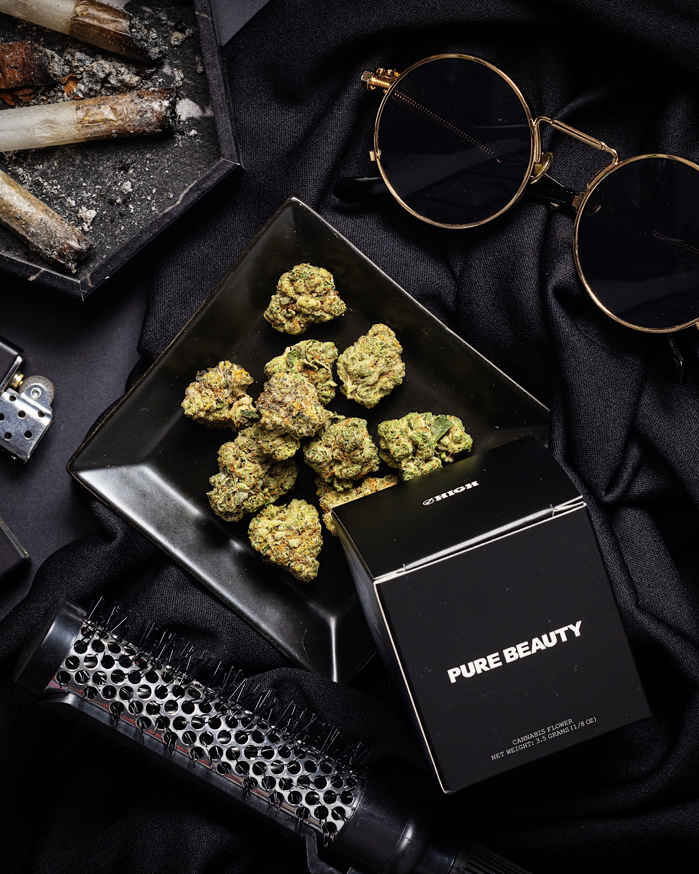
In High Rise’s archive photography, black Pure Beauty boxes sit beside loose flower and everyday objects. The brand name is small enough to leave breathing room. Other packaging uses a bright yellow field with straightforward black lettering. Neither treatment needs a wall of illustrated smoke to announce the category.
That restraint changes the order in which you notice things. Shape, color and the flower itself arrive before a long sales pitch. It gives a still-life photograph something to work with beyond a floating logo. The package belongs in the composition instead of swallowing the whole frame.
Minimal packaging does not automatically mean minimal material, of course. Appearance and construction are separate questions. What makes this example worth examining is that Pure Beauty discusses both, even when the practical answers are less tidy than the photograph.
Readers following the wider design conversation can compare this approach with Sundae School’s relationship between cannabis and clothing. The point is not to rank their aesthetics. It is to see how differently brands can express a point of view without borrowing the same visual shorthand.
Read the cultivation story as a process
Pure Beauty’s cultivation page describes an indoor growing system built around living soil, LED lighting and water recovery. Its account places microorganisms and other living components inside the growing process, rather than treating soil as an anonymous substrate.
Those are descriptions of the company’s methods. They should not be inflated into a blanket environmental certification or a promise about every product. A grow page explains what a producer says it does. Independent measurement would answer a different set of questions about the scale and results.
That distinction makes the story more useful, not less interesting. A reader can ask where water comes from, what happens to plant material and how the growing environment is managed. Those questions reveal more than an unexplained green leaf icon on the front of a bag.
The accompanying grow photograph also changes the mood of the brand. Rows of plants under colored light look very different from its spare packaging. Seen together, the images connect the finished object with the working room behind it. The contrast gives the identity some depth.
The packaging claim has an important limit
On its about page, Pure Beauty says it tries to reduce packaging material and describes developing a child-resistant bag made from plant starch. The page also acknowledges that its approach is imperfect. That admission is more useful than pretending a cannabis package has no footprint.
The brand’s FAQ adds product-specific detail, including paper boxes and an industrial-composting distinction for certain packaging. Industrial composting is not the same instruction as tossing something into a backyard pile. Readers should follow the instructions on their actual package and the requirements of the facility receiving it.
The design lesson is straightforward: a material story should survive a closer look. If a package uses less decoration, its construction can become more noticeable. The closure, insert and outer box all become part of the experience, even when none appears in the hero photograph.
A photographer gets more than a credit line
The brand’s October 2024 feature on photographer Jack Bool gives a collaborator space beyond a campaign credit. It discusses his Bay Area background, photography education and work with books and independent publishing. Cannabis is part of that setting, rather than the only subject allowed into the room.
That editorial choice matters. A photographer’s references can help explain why an image looks the way it does. Books, music scenes and personal projects provide a different kind of context than a list of product specifications. They make the person behind the camera visible.
For a cannabis audience, this is a useful expansion of what a brand feature can include. The people shaping a label’s appearance are part of its cultural output. Their work does not become irrelevant because a retail package happens to be the object being photographed.
It also creates something worth returning to after a particular release disappears. A dated collaboration can remain an interesting document of a creative relationship. That does not require pretending the associated product is still sitting on every dispensary shelf.
Genetics collaborations need their own credits
Pure Beauty’s August 2024 Purple City Genetics announcement names Lemon Sportif, Toronja, and Strawberries and Durban. It presents the collaboration as a specific release with another participant, rather than making the cultivar names appear from nowhere.
The useful detail is the partnership itself. Breeding, selection, cultivation and packaging are different kinds of work. Naming a genetics collaborator gives readers another thread to follow and helps keep those contributions from collapsing into a single brand logo.
That announcement is also a historical source. Its original release language does not establish current stock, nationwide availability or a present-day menu. A strain name can remain searchable long after a batch is gone. A reader comparing lineages can use High Rise’s strain-library overview while checking current product details separately.
Following those credits can lead you from a retail release into the work behind it. Who developed the genetics, who grew the flower and who put their name on the package form different chapters of the same story.
The film project fits the wider picture
In its August 2026 announcement for The Wrong Girls, Pure Beauty describes a limited Babies collaboration connected to Dylan Meyer’s film. The announcement names Kristen Stewart and Alia Shawkat and says Meyer selected the cultivars for the release.
That is a concrete connection between the project and the product. It gives the collaboration more specificity than simply printing a movie title onto a familiar box. The announcement preserves that creative connection even after the limited release moves beyond its original launch window.
Placed beside the photography feature, the release suggests a recognizable editorial interest in creative people. The projects are different, but they share an appetite for references outside the usual dispensary display. That is where the brand’s visual restraint starts to feel like a useful foundation.
One name can cover different shopping channels
Pure Beauty’s FAQ distinguishes its California cannabis offering from hemp products sold through its online store. It also describes different sourcing for those channels. Readers should not assume that every item carrying the name comes from the same cultivation operation or follows the same distribution route.
That is especially relevant when a social image sends you to a website. A photograph can travel farther than the specific product pictured. Before treating a release announcement as a shopping instruction, check the product page, location and current stockist information.
The wider issue is familiar across cannabis brands with editorial ambitions. Miss Grass’s path from media into products offers another example of a name carrying several kinds of activity. The audience benefits when the distinctions remain clear.
What makes the identity hold together
Pure Beauty is most interesting when its separate pieces remain visible: the grow, the packaging, the photographer and the collaborator. None needs to serve as proof of the others. Attractive art does not verify cultivation claims, and a detailed grow explanation does not make every collaboration compelling.
What holds the identity together is the room it leaves for each contribution. The plant can be photographed without visual shouting. A collaborator can have a history beyond the campaign. A packaging claim can include a limitation. That gives cannabis culture more to work with than another expensive-looking box.